During the time allocated to us, we had to come up with characters, stories, ideas etc and develop it and upload them into our own personal blog. Each week we were told to upload a few pieces of work and maybe talk about them. We were also told to compare two 2d or 3d programs, discuss the animation principles and talk a bit about lip synch.
Normally, I wouldn’t research about lip synch but after doing so, I’ve learned a few new things that could help me later in the future. One being the importance of getting the mouth shape right to match the sounds in a sentence/phrase said. The same can be said for the animation principles. I never knew there was such a thing! Most animations seem to follow these set of rules one way or another (some animations do not use all principles). It was interest ding learning and researching each principle, it definitely helped me understand how to make an animation successful and how to portray the right message across to the audience.
I also animated a walk cycle on two 2d programs - flash and toon boom. The reason for this was, I wanted first hand fresh experience of the twp programs, animating the same thing, before a make a comparison - just to be more accurate. In the end, toon boom won just because it was a lot easier to draw and it did not try and help me by “straightening out” my curved lines. The interface on toon boom was also easier to understand (e.g. the symbols were more recognisable etc). Also, for both programs I used my Wacom graphics tablet and realised the lines looked better on toon boom than flash! So overall, toon boom wins hands down.
I also throughout the 6 weeks, found myself changing my mind a lot - being very indecisive. Id think of an idea… end up forgetting it because I came up with another one then forgetting that one and came up with another one because I never really liked the ideas I had to stick with them. Even after the 6 weeks, I’m still not 100% confident in my mecha/robot designs. However, I will definitely finalise them before I start to animate them.
~ Message from the little elf ~
Contact me at elf@dodgyapple.com
Thursday, 13 March 2008
Sunday, 9 March 2008
Animation Principles and Lip~Synch
Squash and Stretch:-
Even though disney was all for “realism” in its animations, he did apply the squash and stretch technique in them. An example of this is in Hercules (1997).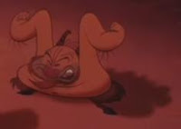
He started it form the start with the seven dwarfs (doc, dopey and grumpy). This technique gives characters or objects a cartoony feel to their movement.
Squash and stretch is very important in all animations and is usually applied on fleshy, rubberly, fexilble etc objects or even certain type of cloth. Rigid objects like a chair will not use this technique unless the character as "Alive" (like the chair in Beauty and the Beast".)
There are different reasons for using this technique. It can be used to get a more flowing feel to certain movements and gives the object more realism and weight. For example, when a character is jumping up, his/her body will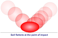 stretch up.
Sometimes, the animators will exaggerte with the squash and stretch to emphasis the power behind the movement.
Stretching objects like a bounching ball just before and after it touches the ground gives the illusion of great speed behind the bounce.
However, when using this rule, an important thing to remember is the volume of the squashed/ stretched object will never change.
A good example of this squash and stretch technique is a bouncing ball.
Exaggeration:-
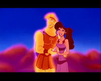
Most animations tend to use some exaggeration to show off actions or characteristics of a character or object. It helps the audience understand easier what is being portrayed. If a character is angry, then it is often a good idea to exaggerate his/her emotion by making him furious so the audience can get a feel of the important points. Or if the animator wants to make a point clear that a character is tired, then they can make him/her yawn and stretch out their arms and slightly tilt their head back to give the tiredness more strength.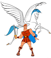 It doesn’t not only have to be characters, exaggerated objects can work too. An example of exaggeration in a Disney film would be Hercules. Hercules’ muscle and waste is a clear sign. The reason why he was given a heavy top and narrow bottom was to make his strength stand out.
However, too much exaggeration can be a bad thing too as it clouds the more powerful scenes - will not make the important scenes stand out. So a balance is require so the audience can see what is really exaggerated and what is not.
Anticipation:-
There are three parts to Anticipation.
- The before (usually backward motion) is the anticipation
- The actual action
- The end of the action
Anticipation is required to prepare the viewer for what’s about to happen - usually something major or important. For example, when a character’s about to deliver a powerful kick, he/she will bring his/her leg back (anticipation) for momentum before they actually perform the kick/ connect with the object they are about to kick.
It attracts the viewers attention (to a particular part of the screen if required) and prepares us so the viewers know what will happen - less confusion for the viewers.
Anticipation also helps portray the weight of a heavy object. For example, if a character needs to pick something up from the ground, he/she will bend down low as possible, with legs spread out for good balance, lift from the bottom and strain to lift it up. Whereas if he/she was to pick up a matchbox from the ground, all he/she needs to do is bend down to pick it up with little effort.
Follow Through and Overlapping Action:-
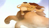
Here is a screenshot from The Lion King (1994). Mufasa’s saving Simba from the wildebeest. Simba was flying towards the bottom right of the screen but because Mufasa suddenly grabbed him and changed his direction, Simba’s tail has not caught up yet and is still moving in the original direction. Follow Through helps make an animation more realistic. It can help express the power, speed or suddenness of the movement. However, timing will have to be planned out carefully or it will not look right.
Overlapping keeps a continuous flow between actions and so makes objects seem more natural and exciting.
Lip ~ Synch:-
Lip synch is a very hard thing to get right in any animation. If it is not done right then it can ruin a very good piece of animation (unless the creator is after that effect for humour). The only way to get it right is it say it yourself in front of a mirror. Or ask someone to say the words and you watch their mouth movements carefully. However, with today’s technology, animation programs like Toon Boom will automatically lip synch your words for you - making it easier but it is still a good idea to learn it the old fashion way to get a better understanding.
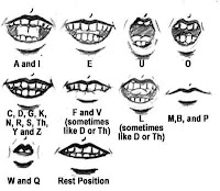
When we say a sentence, we do not pronounce every single letter nor do we say each word clearly. In animation, we do not lip synch letters, but sound. Animating each syllable instead of letters will not work either, other wise the mouth will be moving far too much for it to be realistic. Most of the words in the sentence merges together so it can be difficult to see which mouth movement we actually need. So when we animate the mouth, we need to actually see and say out loud what we want to animate in order to get it right. There are approximately 44 phonemes in the English language.
Here are some basic phonemes.
~ Message from the little elf ~
Even though disney was all for “realism” in its animations, he did apply the squash and stretch technique in them. An example of this is in Hercules (1997).

He started it form the start with the seven dwarfs (doc, dopey and grumpy). This technique gives characters or objects a cartoony feel to their movement.
"Squash and Stretch -- Defining the rigidity and mass of an object by distorting its shape during an action." - John Lasseter
Squash and stretch is very important in all animations and is usually applied on fleshy, rubberly, fexilble etc objects or even certain type of cloth. Rigid objects like a chair will not use this technique unless the character as "Alive" (like the chair in Beauty and the Beast".)
There are different reasons for using this technique. It can be used to get a more flowing feel to certain movements and gives the object more realism and weight. For example, when a character is jumping up, his/her body will
 stretch up.
Sometimes, the animators will exaggerte with the squash and stretch to emphasis the power behind the movement.
Stretching objects like a bounching ball just before and after it touches the ground gives the illusion of great speed behind the bounce.
However, when using this rule, an important thing to remember is the volume of the squashed/ stretched object will never change.
A good example of this squash and stretch technique is a bouncing ball.
Exaggeration:-

Most animations tend to use some exaggeration to show off actions or characteristics of a character or object. It helps the audience understand easier what is being portrayed. If a character is angry, then it is often a good idea to exaggerate his/her emotion by making him furious so the audience can get a feel of the important points. Or if the animator wants to make a point clear that a character is tired, then they can make him/her yawn and stretch out their arms and slightly tilt their head back to give the tiredness more strength.
 It doesn’t not only have to be characters, exaggerated objects can work too. An example of exaggeration in a Disney film would be Hercules. Hercules’ muscle and waste is a clear sign. The reason why he was given a heavy top and narrow bottom was to make his strength stand out.
 However, too much exaggeration can be a bad thing too as it clouds the more powerful scenes - will not make the important scenes stand out. So a balance is require so the audience can see what is really exaggerated and what is not.
Anticipation:-
There are three parts to Anticipation.
- The before (usually backward motion) is the anticipation
- The actual action
- The end of the action
Anticipation is required to prepare the viewer for what’s about to happen - usually something major or important. For example, when a character’s about to deliver a powerful kick, he/she will bring his/her leg back (anticipation) for momentum before they actually perform the kick/ connect with the object they are about to kick.
It attracts the viewers attention (to a particular part of the screen if required) and prepares us so the viewers know what will happen - less confusion for the viewers.
Anticipation also helps portray the weight of a heavy object. For example, if a character needs to pick something up from the ground, he/she will bend down low as possible, with legs spread out for good balance, lift from the bottom and strain to lift it up. Whereas if he/she was to pick up a matchbox from the ground, all he/she needs to do is bend down to pick it up with little effort.
Follow Through and Overlapping Action:-
"Things do not come to a stop all at once…; first there’s one part and then another." - Walt Disney
Follow Through is when the main body of a character suddenly stops while the rest of its body or accessories continue to move on. For example, if we imagine a long haired heroine flying forward in the air, she suddenly stops. Her hair, cape etc would still move forward because like Walt Disney said, things do not stop all at once. An example can be seen in Scooby Doo, when Scooby’s running away from a monster and suddenly stops and turns round but his tail carries on moving forward. 
Here is a screenshot from The Lion King (1994). Mufasa’s saving Simba from the wildebeest. Simba was flying towards the bottom right of the screen but because Mufasa suddenly grabbed him and changed his direction, Simba’s tail has not caught up yet and is still moving in the original direction. Follow Through helps make an animation more realistic. It can help express the power, speed or suddenness of the movement. However, timing will have to be planned out carefully or it will not look right.
Overlapping keeps a continuous flow between actions and so makes objects seem more natural and exciting.
Lip ~ Synch:-
Lip synch is a very hard thing to get right in any animation. If it is not done right then it can ruin a very good piece of animation (unless the creator is after that effect for humour). The only way to get it right is it say it yourself in front of a mirror. Or ask someone to say the words and you watch their mouth movements carefully. However, with today’s technology, animation programs like Toon Boom will automatically lip synch your words for you - making it easier but it is still a good idea to learn it the old fashion way to get a better understanding.
When we say a sentence, we do not pronounce every single letter nor do we say each word clearly. In animation, we do not lip synch letters, but sound. Animating each syllable instead of letters will not work either, other wise the mouth will be moving far too much for it to be realistic. Most of the words in the sentence merges together so it can be difficult to see which mouth movement we actually need. So when we animate the mouth, we need to actually see and say out loud what we want to animate in order to get it right. There are approximately 44 phonemes in the English language.
Here are some basic phonemes.

~ Message from the little elf ~
Thursday, 6 March 2008
Stop Motion Animation
My group stop motion animation about aliens! Quality's poor though because I had to compress it... The original was way to big D=
~ Message from the little elf ~
~ Message from the little elf ~
Design for Mechas/Robots
I'm pretty much drawing my inspiration for the mechas/robots in my animatic from two sources. Transformers: The Movie and animes like Evangelion/Full Metal Panic/Gundam etc.
I would design my own... but to be honest, I'm not really good at drawing/designing machiney things.
So why from animes? The "robots" we all see from animes are called Mechas. They're similar to Robots but the design is usually more complex and less blocky. They are machines with a cockpit for a pilot to control it and have legs rather than the usual wheels like Wall-E. Click here, here, here for Mecha references.
Why Transformers: The Movie? Basically because they're different to Mechas but not too much. I'm drawing inspiration from two sides of the world, America and Japan. So if I use both as a reference, I'm not exposed to a large difference. Also, I watched Transformers: The Movie when I was younger and loved it (1986 movie). Although I'm not a huge fan of the T.V. series or the 2007 CGI movie, I still want to use the 1986 movie as my main source of inspiration for my mini mecha/robots.
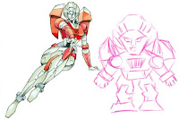
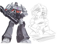
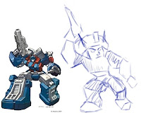
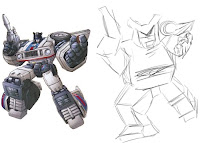
I know I'm really no good at this... but here's a few sketches from Transformers: The Movie. I will do more later since I'm not too fond of any of these.
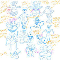
This one I drew in uni, without looking at any reference. They're just rough items in my head.
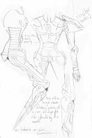
My first attempt at Mecha... This is why I decided to make my mecha/robots mini ones...
Too much work involved in this =( and I couldn't even finish it because I never liked how the head turned out.
[Edited 09/03/2008] So... I think I will keep/post all the mecha/robot stuff together - so it's easier to organise.
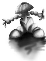
I just drew whatever came to my head at that point. But after I finished, The top part of this design (was suppose to be a head) looks like a sakkat!! And it reminded me of a picture I saw of a Japanese Samurai wearing a sakkat.... Soooooo... It got me thinking... why not base my 3 mini mecha/robots on certain warriors/fights instead of just designing them randomly?! This way they will each have their own distinctive characteristics! Looks, clothes, weapons, personailty etc. They will keep their own traditional clothes/armour and weapon type e.g. sword for the samurai, gun for the musketeer etc. But I will be upgrading them to something more...... powerful ^^
Warriors/Fighters (Ideas):-
Japanese Samurai
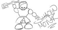
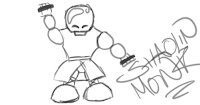
Shaolin Monk
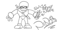
Ninja
Assassin
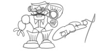
Musketeer [Edited 10/03/2008] Yea.. so there's a slight problem with a Musketeer. I totally forgot Victoria was gonna use a Musketeer for her part of the animatic. So I've decided to change it into a Cowboy instead ^^ And I've also added in new images of what they would probably look like. They're only sketches... If I can I will do proper ones I will upload them instead. If not, then they will go in the group blog later.
Weapons:-
Japanese Samurai:-
- Keep it's old traditional sword
- Upgrade the sword to huge butchers knife
- Upgrade the sword to a Lightsaber
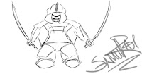
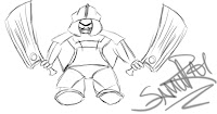
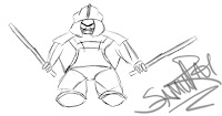
Shaolin Monk:-
- Upgrade the spade to an actual gardening spade
- Upgrade the training pole to a toothpick ?
- Upgrade the staff to ______?
- Upgrade the gloves to knuckle dusters?
Ninja:-
- Upgrade their small knife (or kunai etc) to a swiss army knife
- Upgrade the throwing stars to a starfish - stick to their face to block opponents vision
Cowboy:-
- Upgrade its gun to a rocket launcher
~ Message from the little elf ~
I would design my own... but to be honest, I'm not really good at drawing/designing machiney things.
So why from animes? The "robots" we all see from animes are called Mechas. They're similar to Robots but the design is usually more complex and less blocky. They are machines with a cockpit for a pilot to control it and have legs rather than the usual wheels like Wall-E. Click here, here, here for Mecha references.
Why Transformers: The Movie? Basically because they're different to Mechas but not too much. I'm drawing inspiration from two sides of the world, America and Japan. So if I use both as a reference, I'm not exposed to a large difference. Also, I watched Transformers: The Movie when I was younger and loved it (1986 movie). Although I'm not a huge fan of the T.V. series or the 2007 CGI movie, I still want to use the 1986 movie as my main source of inspiration for my mini mecha/robots.
I know I'm really no good at this... but here's a few sketches from Transformers: The Movie. I will do more later since I'm not too fond of any of these.


This one I drew in uni, without looking at any reference. They're just rough items in my head.

My first attempt at Mecha... This is why I decided to make my mecha/robots mini ones...
Too much work involved in this =( and I couldn't even finish it because I never liked how the head turned out.

[Edited 09/03/2008] So... I think I will keep/post all the mecha/robot stuff together - so it's easier to organise.

I just drew whatever came to my head at that point. But after I finished, The top part of this design (was suppose to be a head) looks like a sakkat!! And it reminded me of a picture I saw of a Japanese Samurai wearing a sakkat.... Soooooo... It got me thinking... why not base my 3 mini mecha/robots on certain warriors/fights instead of just designing them randomly?! This way they will each have their own distinctive characteristics! Looks, clothes, weapons, personailty etc. They will keep their own traditional clothes/armour and weapon type e.g. sword for the samurai, gun for the musketeer etc. But I will be upgrading them to something more...... powerful ^^
Warriors/Fighters (Ideas):-
Japanese Samurai
Shaolin Monk
Ninja
Assassin
Musketeer [Edited 10/03/2008] Yea.. so there's a slight problem with a Musketeer. I totally forgot Victoria was gonna use a Musketeer for her part of the animatic. So I've decided to change it into a Cowboy instead ^^ And I've also added in new images of what they would probably look like. They're only sketches... If I can I will do proper ones I will upload them instead. If not, then they will go in the group blog later.
Weapons:-
Japanese Samurai:-
- Keep it's old traditional sword
- Upgrade the sword to huge butchers knife
- Upgrade the sword to a Lightsaber


Shaolin Monk:-
- Upgrade the spade to an actual gardening spade
- Upgrade the training pole to a toothpick ?
- Upgrade the staff to ______?
- Upgrade the gloves to knuckle dusters?


Ninja:-
- Upgrade their small knife (or kunai etc) to a swiss army knife
- Upgrade the throwing stars to a starfish - stick to their face to block opponents vision

Cowboy:-
- Upgrade its gun to a rocket launcher

~ Message from the little elf ~
Drawing Style
Forgot to post about this earlier. We discussed this for quite some time but didn't know how to fix this problem. We didn't know "how" our animatic would look. We talked about splitting the animatic in sections: background, characters and sound but it still didnt seem fair and we were not each expressing what we could fully do. E.G. Whoever took up the sound department wouldn't be able to take part in any drawing etc.
So after discussing it many times, we decided to split the animatic in another way. Each of us will animate and sound synch our own part of the animatic. The intro (all 3 walking into class) and the ending (lecturer walking into class) will probably be done in a very simple style - probably stick figure.
This way:-
- The intro will be simple and we can easily split that between us.
- We can each express ourselves any way we want.
- It will be fair on all of us.
- The simple intro will create a better opening for the main part.
~ Message from the little elf ~
Wednesday, 5 March 2008
Flash vs Toon Boom
Both Flash and Toon Boom are powerful animation software to use. Each with its own pros and cons.
I will be comparing Macromedia Flash Professional 8 with Toon Boom Studio 4; there is no other way to review and compare programs unless you have tried them yourself. I have made similar short animations on both to test out the features and this is what I found out:-
Flash 8:-
After using Flash myself, I found it harder than Toon Boom. Even though it kinda looked simpler - it was not. Drawing was much more difficult because it would sometimes try to “fix” your lines (e.g. straighten out a curve). But the way how the program registered some of the stroke’s thickness was interesting.
For the brush tool, you got to choose 10 different sizes of brush and 9 different shapes. This could have been a slight problem since I could not customise my own size. However, since I had a graphic tablet it was not much of a problem.
Flash also lined up my selected object by making a faint, coloured, dotted line appear vertically and horizontally when it thought I was trying to line it up with another object. For example, if I wanted a button on the far left of the page to be in line with another button on the far right of the page, Flash would automatically help me line up the button with a faint, dotted line. I found this very handy, which was lacking in Toon Boom.
Flash also allows me to select “a part” of a line. For example, if I drew a candy cane using one line only and wanted to remove the hook, I could use the Selection Tool and drag a box around the area I want to remove - very handy for stuff like detail. On Toon Boom, I could only select the whole line, and if I wanted to remove the hook then I had to form a break in the line by erasing.
Flash also allowed me to undo selected items.
I did notice that things were faster on Flash than Toon Boom.
Toon Boom 4:-
After animating a walking cycle on Toon Boom, I found most of the tools and functions fairly easy to use. There was enough work space with various different side bars. The layout was pretty similar to the previous versions which was a good thing because it was easy to navigate around it. Since I started Toon Boom on a previous version, the new version did not feel so alien like.
Originally when I made my first animation on Toon Boom, I didn’t understand how to move the camera and use thee pegs. However, after I finally settled down to learn about the camera, I found out it was actually pretty simple and straight forward.
There were a few things about Toon Boom that Flash did not have. For example, automatic lip-synch. Toon Boom will automatically show you (out of the possible 8 mouth shapes) which one suits any piece of dialog which definitely saves time and effort. This makes it a lot easier for the animator by helping them make the lip synch more accurate. Of course, it is possible to adjust the mouth shapes if it is required but the occasion is rare.
There are more brushes to choose from to give certain effects and a new thing called feather edge which blur out objects. this is good since for effects like smoke, using the feather edge tool allows a more believable smoke effect.
Overall, Both program are great animation software, each lacking in different things but makes up for it in the things its got.
Personally I would use Toon Boom over Flash because I found it easier to draw.
~ Message from the little elf ~
Script
E-Ling’s script.
Team Squiggle ~
Opening:- E-Ling, Natalie and Vix all enter class and sit in their own seats.
E-Ling’s follow with a mafia mob behind her, all looking shifty. She sits down and brings out her sketchbook and starts to draw.
Camera:- Back view of her and mob entering the class.
- Mid shot of her sitting and drawing
- Close up of what she’s drawing.
- *CUT SCENE*
E-Ling’s still drawing but on her second sketch (you can see she’s on her next page). Her first mecha/robot’s come to life and is moving about.
Camera:- Mid shot of her sitting and drawing. Mecha/Robot wandering around on the desk in the foreground.
- *CUT SCENE*
E-Ling’s now on her 3rd drawing (you can see she’s on a new page). Her second mecha/robot has also come to life and is fighting with the first mecha/robot. E-Ling suddenly notices while sketching.
Camera:- Mid shot of her sitting and drawing. Mechas/Robots fighting on the desk in the foreground.
- *CUT SCENE*
There is now 3 mecha/robots running around fighting each other but E-Ling is controlling the third mecha/robot with her drawing equipment as a control pad.
Lots of mess/ explosion/ dangerous things.
Ending:- Lecturer walks in and sees the disaster going around. Might do something to him - not decided yet.
*NOTE* There is no dialog but you can hear the mecha/robots squeaking. Like the teacher in Snoopy.
~ Message from the little elf ~
Storyboard
Tuesday, 4 March 2008
Decision On Story
I did have an idea for my animatic originally. I was going to use a character I've been working on for a while and put her in a crazy world of robots - have her try to fit in the mechanical world - dealing with certain emotions and scenarios just to fit in. But, I then realised it was a group project and decided to ditch that idea and come up with a fresh one with my group instead. When we decided to base our animatic on ourselves, we decided to each come up with a scenario for when we all enter our classroom. It took me a while to decide on my one.
Since it’s a drawing module, we decided to keep the idea of drawing throughout all our individual parts. So we will each be drawing… I think…
Here is a list of some of the possible scenarios (most are brief because I didn't develop the idea anymore):-
Idea 1:- - Character walks into classroom normally, followed by her mafia members.
- Character brings out her sketch book and starts drawing randomly and simply.
- Suddenly a monster comes crashing through the room and starts to attack me.
- Mafia members then bring out their firearm and starts to protect the character.
- Since she isn’t skilled in anyway, she turns to a new page on her sketch and starts drawing the mafia members with bigger guns, capes, helmets etc. power rangers style!
- The mafia members win and save the day
Idea 2:- - Character walks into classroom normally, followed by her mafia members.
- Character brings out her sketch book and starts drawing a zombie.
- Then all of a sudden, she channels her powers and starts to bring back the dead to life. (The uni is built on top of a graveyard.)
- The zombies appear from the ground and starts attacking.
Idea 3:- - Character walks into classroom normally, followed by her mafia members.
- Character brings out her sketch book and starts drawing planes.
- She then starts to make paper planes and draw in the details etc.
- She then sends the plane flying and it morphs into a real plane.
- Character jumps on the plane and starts controlling it, flying all round the room.
Random Thoughts:- - Pirates fighting mermen for the sea.
- Famous cartoon characters battling each other.
Final scenario I’ve chosen is:-
- Character walks into classroom with a mob of mafia members around her to protect her.
- The character then brings out her sketchbook and starts drawing some mecha/robots.
- She then starts to build them using parts from a box. OR they come to life form her sketches.
- When she has finished her second model, the first one starts to come to life. When she’s on her third one, the second one comes to life and she notices the other 2 mecha/robots fighting on her table.
- She then turns her pencil/sketchbook into a control pad and starts to control the 3rd mecha/robot and tries to stop the other 2.
- Lost of explosions etc.
OR
- Character walks into classroom with a mob of mafia members around her to protect her.
The character then brings out her sketchbook and starts drawing some mecha/robots.
- She then starts to build them using parts from a box. OR they come to life form her sketches.
- When she has finished her second model, the first one starts to come to life. When she’s on her third one, the second one comes to life and she notices the other 2 mecha/robots fighting on her table - growing in size.
- She then finishes her third mecha *cut scene*
- All 3 mecha/robots are huge and fighting each other. Characters in the 3rd mecha/robot trying to stop the other 2 from fighting.
In the end I choose the 1st one (my character controlling the 3rd model using her drawing equipment). I thought since she started it in her sketchbook and pencil then she might as well control it using them too. Plus, to design 3 huge mecha/robots would mean more detail and for this I'd rather just keep it simple. =)
Originally I wanted huge mechas/robots - 3 of them in totaly. However.. after sketching a few, I relised I'm not actually good at it and was never satisfied with my work - in the end got fustrated >_<.
So instead of making huge mechas/robots. I've reduced their size by... a lot.
~ Message from the little elf ~
Dressing 'Em Up!
In one of my lectures, I was told to dress up our character - give them various outfits and put them in difference situations. Here's a few examples of my character in various outfits.


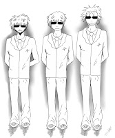
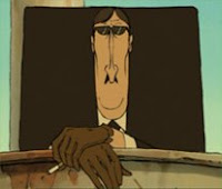
Here's a quick image of my mafia members. I wanted to keep them simple and square like. After watching the French animation, Les Triplettes de Belleville Rendez-Vous (2003) by Sylvain Chomet a few times, whenever I think of mafia/ suited bad guys etc, I always imagined them to have a boxy shape to them. I might make them more boxy later =)
Click here or here or here or more pictures of them.
~ Message from the little elf ~


Here's a quick image of my mafia members. I wanted to keep them simple and square like. After watching the French animation, Les Triplettes de Belleville Rendez-Vous (2003) by Sylvain Chomet a few times, whenever I think of mafia/ suited bad guys etc, I always imagined them to have a boxy shape to them. I might make them more boxy later =)


Click here or here or here or more pictures of them.
~ Message from the little elf ~
Subscribe to:
Comments (Atom)

